

In today’s digital age, mobile devices have become the primary means of accessing the internet.
As a website owner or designer, it is crucial to prioritize mobile responsiveness to provide an optimal user experience. Elementor, the best page builder for WordPress (in our opinion), offers a range of features and techniques to ensure that your website is responsive on mobile devices.
In this article, we will explore various tips and tricks to help you achieve seamless mobile responsiveness with Elementor.
1. Choose a Mobile-Friendly Elementor Theme
To lay a strong foundation for mobile responsiveness, begin by selecting a mobile-friendly theme. Ensure that the theme is built with responsive design principles in mind, allowing your Elementor-powered pages to adapt seamlessly across different screen sizes. Read about our best WordPress themes here.
2. Utilize Elementor’s Responsive Toggles
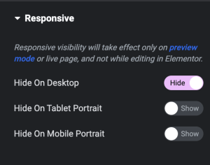
Elementor provides a responsive toggle switches that allow you to hide certain parts of the page from users on certain devices. Often you’ll find that say, an image looks great on a desktop but on mobile it would be too small. This way you can hide it and show that information in a different way to mobile users.
3. Enable Responsive Editing Mode
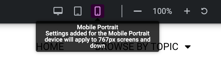
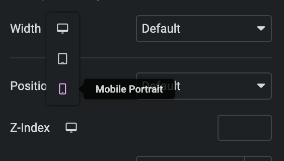
Elementor offers a responsive editing mode that allows you to switch between different screen sizes (desktop, tablet, and mobile) while designing your pages. This feature enables you to see how your content adapts and make necessary adjustments for a smooth mobile experience.
4. Optimize Typography and Font Sizes
Text readability is crucial on mobile devices. Ensure that your typography settings are appropriately optimized for mobile screens. Adjust font sizes, line heights, and spacing to enhance legibility and readability across various mobile devices.
5. Use Mobile-Specific Elementor Widgets
Elementor provides a range of widgets that are specifically designed for mobile devices. These widgets enable you to add mobile-specific functionality, such as hamburger menus, mobile sliders, and click-to-call buttons.
By leveraging these widgets, you can enhance the mobile experience and provide users with seamless navigation options.
6. Responsively Design Images:
Images play a significant role in web design, and it’s essential to ensure they are appropriately displayed on mobile devices. Elementor allows you to set different image sizes for different devices, optimizing loading times and reducing bandwidth usage.
Additionally, consider using image compression techniques to maintain a balance between image quality and performance on mobile devices.
7. Prioritize Mobile Page Speed
Mobile users expect fast-loading websites. Elementor provides various optimization options to help you achieve optimal performance. Minimize the use of heavy animations, unnecessary scripts, and large media files that can slow down your pages.
Utilize caching plugins and optimize your website’s code to deliver a fast and responsive mobile experience.
8. Test and Preview on Different Devices
To ensure the best mobile responsiveness, it’s essential to test and preview your website on various devices and screen sizes. Elementor’s live preview feature allows you to see how your pages will look across different devices in real-time.
Regularly test your website on smartphones, tablets, and different mobile browsers to identify and resolve any issues promptly.
9. Embrace Mobile-First Design
A mobile-first approach involves designing for mobile devices first and then scaling up for larger screens. By embracing this strategy, you ensure that your website delivers an exceptional experience on mobile, which is where most users will engage with your content.
Elementor’s responsive editing features make it easier to adopt a mobile-first design philosophy.
10. Stay Up to Date
Elementor regularly releases updates and enhancements to improve mobile responsiveness and overall performance. Stay informed about new features and best practices by regularly checking for updates and engaging with the Elementor community.
Upgrading to the latest version ensures that you have access to the most advanced mobile responsiveness features.
Conclusion
Achieving mobile responsiveness is essential for any website, and Elementor provides a powerful toolkit to help you create seamless experiences across all devices. By following the tips and tricks outlined in this article, you can leverage Elementor’s features effectively and ensure that your website looks and functions flawlessly on mobile devices.
Embrace responsive design, test rigorously, and stay up to date with the latest techniques to provide your visitors with an exceptional mobile experience.